Artist’s Statement
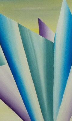
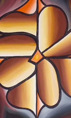
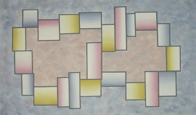
It is easy to describe Ascending Colors if you only look at what they are physically. Each is a block of canvas space, sometimes bounded, that moves gracefully from color to light. A simple yet precise, hand rendered “gradation” that runs the complete saturation of a single or compound color. That could be the complete definition, but it isn’t. Individual Ascending Colors don’t stand alone, rather they become visual elements from which are built abstract, narrative and metaphoric images.
“The Ascending Color Medium” is a phrase that describes the style of technical abstraction that slowly developed over the course of my early active painting years, from 1981 through 1989. Progressing as an artist, I was searching for what would in essence be a visual language for presenting images and narratives, something beyond the strict abstract expressionist model of documenting the art making experience. In these paragraphs I will presents my thoughts on this style of painting and how it evolved. I will discuss the imagery and cognative side of what I strived for in developing this method. The physical side of these works will be discussed, and how and why the act of painting this way proved so compelling. Finally I will consider the name “Ascending Colors”, and why it is, in some ways, a product of the time in which it was created.
An Uncontrollable Urge
I will never know exactly where my motivation to paint came from, only that once I found painting as a creative outlet, I painted every moment I could. Painting for me was both a mode of expression and a physical fulfillment. I wanted to paint and I needed to paint. I called it the “poetry of painting” and described it in a letter to a friend this way:
“The rhythm of the brush strokes, that movement. I think of a loaded brush, thick with raw paint gliding over the rough linen; serene and smooth before the bristles make their way to the surface as the paint thins… And then the sound begins; the aural joins the party, like fingers on the strings, the growl, that scratch. It’s the beautiful industrial sound without which the beauty of the image cannot be manufactured. Its like the chant of Ohm, I find it so unifying. The body moves the brush, the bristles walk across the canvas, the paint becomes the image. Just wonderful.” (1984)
That physical need, dare I say addiction to painting, had led me to consider a concept I began to call “Active Randomness”, a state of activity that exists where rapidly sequenced, low consequence decisions result in a satisfying and measurably productive outcome. This was clearly a self directed experience that was similar to pure expressionism, yet I found the method of “Active Randomness” to be more involving and more scalable than what I had previously thought expressionism to be. I began applying this mindset to painting, and as I did, each time I wanted to take it further. The paint began to hit the canvas at an alarming speed, and in a short time I realized that my notion of “low consequence decision making” had become a subset of the surrealist methodology of automatic painting. I was painting too fast, and my own standard of quality was suffering. I needed to slow down and spend more time with the canvas. It was then that I saw the path to combine the active random sensibility with the dogmatic discipline of the ascending colors. Active randomness would define the background and settings, Ascending colors would be the subjects.
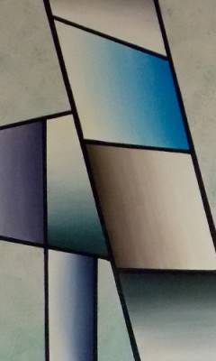
The painting I would call “Stained Glass Blue”, was the first evolutionary step in that development. I placed color and light together and bounded the panes. I was happy with the result but I questioned the method. There was no epiphany. I would pursue surrealism and expressions for nearly two more years before committing to spend the summer of 1983 working on larger canvases with this painting method. The subject matter ranged wildly, from the Manasquan environment to the cast of character who visit any Jersey shore house. By summers end I had taken considerable steps in formulating the medium, though I was far from convinced that it was the voice I was looking for. That would take 3 more years. I concluded that body of work with a painting I would come to call “Ascending Colors”, a work that would name the genre and become my working reference for all that I would call technical abstraction in the future.
 The Physical side of repetitive imagery:
Ascending Colors are physical objects, composed of oil and pigment, held on canvas and placed together in a multiplier that becomes the eventual imagery. Ascending colors are really very large pixels… picture elements. They are visual objects that can serve as a background, a foreground, an element, a reference, a protagonist or antagonist…. They are both places and objects, each a hand made individual and hence each unique. Many sculptors have described their work as three dimensional painting. I choose to turn that around. Via the physical process of moving the color through the light, I create an ascent, a visual and physical object that is readily definable as two dimensional sculpture. Each is a crafted artifact that documents not only my time with that canvas, but the process of developing the medium as a language. At a distance, they can look the same, but up close they are, like their viewers, precision individuals.
But what can this mean? The Visual Object as Metaphor.
The Ascending Colors are is a language. It is a visual language that is used to construct complete works. Each “Ascending Colors” is a visual objects that contributes to the imagery of the overall work. And while these object can be symbolic of something physical or narrative, their application is most often metaphoric.
The book definition of a metaphor is ” a thing regarded as representative or symbolic of something else, especially something abstract”. This is a simple and convenient definition that even includes that most useful of modern artistic terms: abstract! The viewer chooses how to comprehend Ascending Colors as metaphors. Each individual ascent is by consequence, a freestanding statement. Each is an object that is near perfect in its simplicity and presents the viewer with a landscape of possible interpretations.
Binoculor- 1988
Beginning/End – Birth/Death – Day/Night – Up/Down – Dark/Light – Right/Left – In/Out – Start/Finish – East/West – Young /Old – A/B – Zero/One – Theist/Atheist – Positive/Negative
Each individual ascent is a process, a transition device that presents to the viewer all the possibilities, negative and positive, that can be experienced on the transition from one state to another… This remains a truth no matter what you find yourself seeing the states as, be it the equally metaphoric A to B, or the universally practical night to day. This is an important and inherent characteristic of each visual element, for it draws the patron in and in fact requires their participate. Whether using these elements in a technically abstract fashion, or in constructing a narrative, it is the presence of these multiple metaphoric elements that define the viewers experience.
The name Ascending Colors: No apology.
If I had attended Art school, I might have learned that there was a thing called gradations. Had I come of age in a later time, I would have know that there would be a button on Photoshop that would create such images digitally with only a single mouse click. But that is not what happened to me. I found something by seeking knowledge and joy in my own time, and I knew it was something different. I experimented with it, used and abused it, and in the end derived from it what I believed to be a unique method of expression. The name is intentionally optimistic, consciously choosing “Ascending” over “Descending”. No Apology.
I conclude this statement with an invitation to the viewer. It is to easy in the digital age to view only the surface layer of the Photoshop images we are bombarded with on a daily basis. For Art to remain Art, the viewer will need to do more. Be the critical patron, the observer who seeks out the complexity, the humor, the metaphors, and the intellectual challenges of genuine Art. Our children will live better for it.
©M.J.Stumpf 2014